The Beauty of Cool Tones
1. Calming Effect
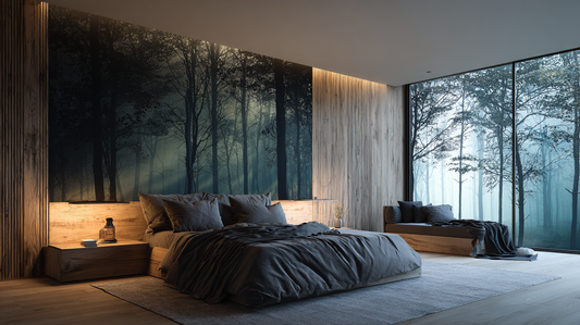
Cool tones have a serene and tranquil quality. They remind us of clear skies, ocean waves, and lush forests. When incorporated into interior design, they create a soothing ambiance that promotes relaxation and stress relief.
2. Modern and Clean Aesthetics
Cool colors lend themselves well to contemporary and minimalist designs. Their crisp and clean appearance adds a touch of sophistication to any space.
3. Versatility
Cool tones are incredibly versatile. Whether you’re decorating a bedroom, living room, or kitchen, these colors adapt seamlessly. They work equally well in small apartments and spacious homes.
The Cons of Cool Colors
1. Risk of Feeling Cold
While cool tones create a calming effect, too much of them can make a room feel chilly and unwelcoming. To avoid this, balance cool colors with warmer elements like textiles, wooden furniture, or warm lighting.
2. Lack of Vibrancy
Cool colors don’t pop as much as warm tones. If you’re aiming for a vibrant and energetic space, consider using cool colors as accents rather than dominating the entire palette.
3. Limited Warmth
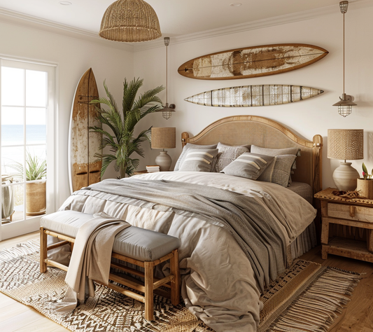
Unlike warm colors that exude coziness, cool tones lack that inherent warmth. If you want a room to feel snug and inviting, consider combining cool colors with warm neutrals or introducing cozy textures.
Tips for Using Cool Colors
-
Layer Shades: Experiment with different shades of blue, green, and purple. Combine light and dark tones to add depth and interest.
-
Texture Matters: Introduce textures like plush rugs, velvet cushions, or woven throws to counterbalance the coolness.
-
Accent Pieces: Use cool colors for accent pieces—think artwork, vases, or decorative pillows. They’ll infuse the space with elegance without overwhelming it.
In conclusion, cool colors have their place in interior design. When used thoughtfully, they create a harmonious and refreshing environment. So go ahead, embrace the cool side of the color spectrum and transform your home into a serene retreat! ❄️🏡